


What would happen if AI decided on ArchiMate® elements; on the colors and icons (or symbols) of the modeling language? Nowadays, a question like this is easily answered. But before discussing how Artificial Intelligence responded to this question, let’s look at where the original colors came from and how they came to be.
Visualizing Architecture
In order to capture and visualize an organization from an architectural perspective, the use of a modeling language is indispensable. In the context of architecture, this language is called ArchiMate. ArchiMate is a globally accepted standard for the visualization of architectural products. It is a modeling language designed to support the visualization, analysis, and communication of Enterprise Architectures. It was born out of the need for a standardized language to model complex enterprise architectures and IT systems.
Today, ArchiMate is used worldwide by architects, organizations and consultants to model and visualize complex architectures. It has become an important tool in the field of Enterprise Architecture, helping to understand and communicate the structure and operation of organizations. The wide acceptance of ArchiMate as a standardized architecture modeling language has contributed to its growth and maturity. ArchiMate is recognized as a highly valuable tool for planning, designing and managing complex architectures.
The Power of Color
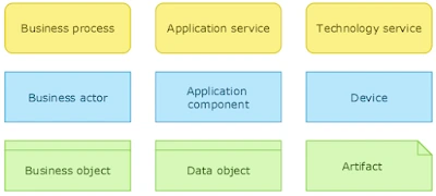
The strength of the modeling language lies in the areas of uniformity and consistency. This applies mainly to the language’s architectural elements and their design. The use of a standard color palette also contributes to the sense of uniformity. Although the modeling language uses yellow for the business operation layer, blue for the application layer and green for the technology layer, the modeling language itself is colorless and completely color independent. The suggested colors are optional.
When the language was developed, the idea was to color the behavioral elements, such as processes and service, yellow. Blue was used for the active elements such as actors, roles, as well as application components and devices. Finally, green was the color assigned to the passive elements. These include objects and artifacts.
Due to a problem with color assignment later in the development of ArchiMate, a different color application was used.
The problem manifested itself when using elements such as interfaces and objects. These elements all have the same shape. This was also true for functions and processes; they all share the same form.
Now, if these elements were used together in the same architecture diagram, it would not be possible to sufficiently distinguish between the elements used. Therefore, it was decided to use the colors at the architecture domain level. Yellow was used for Business Architecture, blue for Application Architecture and green for Technology Architecture. To this day, that color palette still stands.
Enter ChatGPT
Back to the opening question: what would happen if AI decided on ArchiMate elements; on the colors and icons (or symbols) of the modeling language?
By asking ChatGPT how it would color the layers and its elements, it quickly produced the following answer.
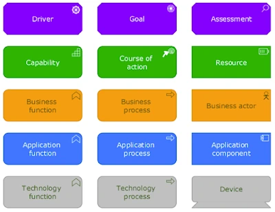
- Business layer: warm and vibrant colors like shades of orange or yellow. These colors can convey a sense of energy, creativity, and dynamism associated with business activities.
- Application layer: cool and calming colors like shades of blue or green. These colors can evoke a sense of reliability, stability, and tranquility, which aligns with the technology and software applications within this layer.
- Technology layer: neutral or cool colors such as gray, silver, or darker shades of blue. These colors can convey a sense of technicality, solidity, and reliability, reflecting the hardware, infrastructure, and technical components within this layer.
- Motivation layer: distinct colors to differentiate the motivation and strategy layers. For example, shades of purple or magenta can represent ambition, purpose, and drive.
- Strategy layer: shades of green or teal can symbolize growth, planning, and strategic decision-making.
It is interesting to see that Artificial Intelligence would base the coloring on the deeper meaning of the elements – what they stand for and represent. So the layer symbolizing energy, creativity, and dynamism (orange or yellow) would be the Business layer, whereas ambition and purpose (purple or magenta) would apply to the Motivation elements. And what to think of using green or teal for the Strategy elements, symbolizing growth, planning, and strategic decision-making.
The only elements that somewhat kept their originally proposed color are the Motivation and Application layer elements. ChatGPT suggested to use purple or magenta for the Motivation layer, and shades of blue or green for the Application layer.
Ugly as Sin
Should you adhere to the suggested coloring, the diagrams one produces would look ugly as sin at first glance… However, the longer you look at it, the more it grows on you and the more appropriate the suggested colors actually seem. Just remember that the real art of architecture lies in something other than visuals (namely the dialogue with the organization).
A Picture and a Thousand Words
All elements provided by the ArchiMate modeling language have small icons. These icons distinguish the different elements from each other. The icons are designed for clarity and consistency in modeling. For those familiar with ArchiMate, I am not saying anything new.
Now, it is striking to see that when the AI is asked to make some suggestions for these icons, others than the already known ones come up.
ChatGPT suggested the following icons for the elements listed below.
- Driver: a triangle with an arrow pointing to a goal or outcome, to indicate the idea of influence or motivation. The original icon resembles a ship’s steering wheel.
- Capability: a pentagonal symbol to represent a general capability, such as a pentagon with Cap written inside. A kind of block-like staircase icon is used as the current symbol.
- Resource: an image of a tool, device, or other relevant object to represent the concept of a resource. This contrasts with the original battery icon.
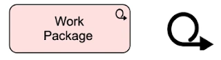
- Work Package: a rectangular symbol with a suitcase, container, tool, or other appropriate symbol inside to represent a work package. A suitcase or container (maybe an opened box?) seems to fit much better than the current icon, which I really have no idea what to call.
Most prominent are the suggested icons for Driver and Work Package. For Driver, ChatGPT shows a preference for the icon currently used for the Course of Action element, which is an arrow pointing to a goal or outcome. The current icon for a Work Package is not suggested by the AI. In contrast, ChatGPT suggests using a suitcase or a tool (think of a hammer, for example).
Fortunately, the AI does not have a completely different opinion on all fronts. The suggested symbol for Goal is the usual one, namely a bullseye-like symbol in the middle to represent the idea of a goal.
If it ain’t Broke…
The icons (or symbols) that have been in use for years are the ones we have come to recognize. If you were to start using different icons from the original ones, it would probably be quite a chore to explain the use of custom icons over and over again. The same goes for using different colors.
As I mentioned before, ArchiMate is colorless and completely color independent. So using AI generated and suggested colors is absolutely possible. But I think sticking to the original suggested and completely optional color palette is much easier on the eyes compared to the colors suggested by ChatGPT.
Nevertheless, it is an interesting idea to base the colors on what they symbolize… Please let me know what you think in the comments section below.


Leave a Reply